Builds 45 and 46: the scanner learns to read a still photograph
Every build of BREWTANICA gets a number. These are the first two to get a write-up, and they arrive together on purpose: build 45 gave the photo scan modes their own extraction lane, and build 46 — cut the next day — finished that work and rebuilt the screen around it. Splitting them would have meant telling half a story twice.
From here the plan is one dispatch per build, unless a build lands mid-sentence like this one did.
The scanner stopped guessing at still photos
Build 45.
Live Scan — pointing the camera at a bottle and letting Ale Intelligence™ work in real time — has always been the mode that works best, because a live camera gives the pipeline dozens of frames to find a readable one. The two photo modes, Photo Upload and Batch, had a harder job: one still image, whatever the lighting was, no second chance.
Build 45 gives those two modes their own extraction lane. Instead of treating a still photo as a bad video frame, it runs native OCR and barcode detection directly against the image on the device, and only falls back to a model pass when the device read comes back thin. Both lanes now answer to a named contract, so a still and a live capture return the same shape of result.
That ordering matters more than it sounds. It means the ABV on a label now
comes from evidence rather than inference: when the device can actually read
6.2% ABV off the can, that reading wins. A printed number survives; a guess
does not get to overwrite it.
The same build taught the pour colour to work in layers — what the label declares first, then what the photograph shows, and only then our own inference — and added two more glassware masters to draw into.
Build 46 finished it
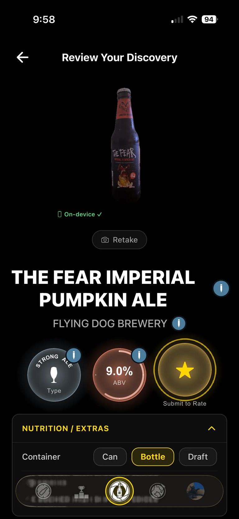
Container size now follows the same rule the ABV does: if the device read it off the label, that is the answer.
One fix in this build is worth naming on its own, because it had been quietly taxing every photo scan: a 12-megapixel capture was being rendered into a 110-megapixel bitmap before Vision ever looked at it. Rendering at native scale instead removed a lot of work that was buying nothing.
The scan landing had a hierarchy problem
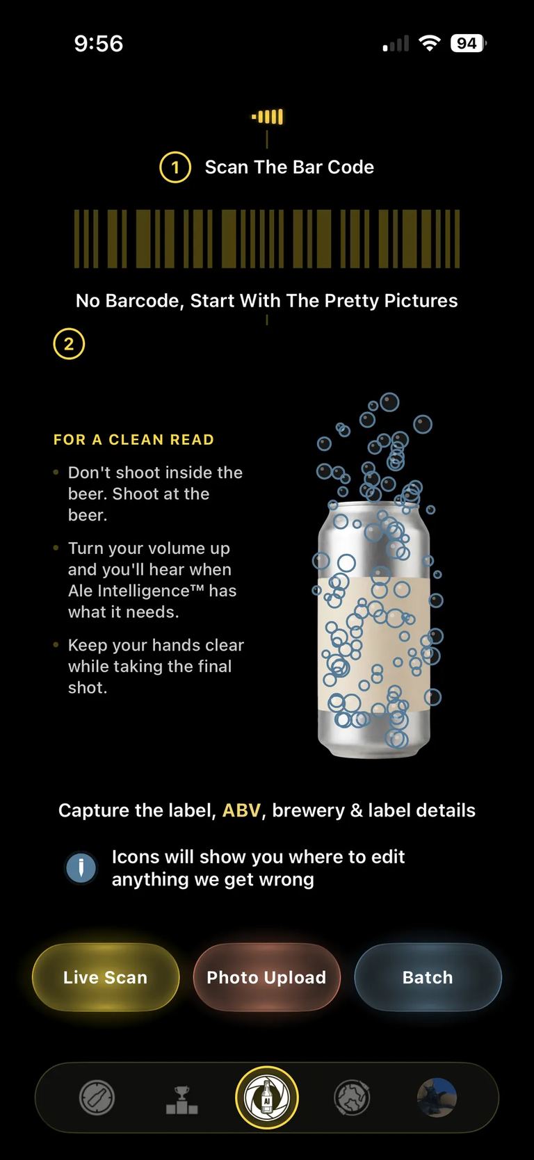
Build 46. Before, and after:
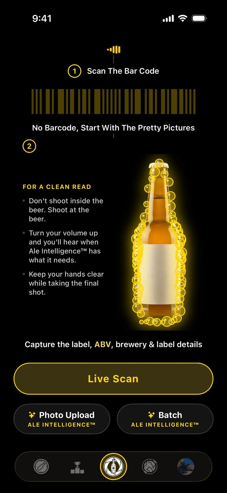
Live Scan was a full-width primary button, with the two paid modes sitting beneath it as a half-width pair, each carrying a gold sparkle and an "Ale Intelligence™" sub-label. The layout said Live Scan was the real feature and the other two were add-ons. That was never the intent — they are three ways of doing the same thing, suited to different moments.
They are now one row of three equal pills. Each takes one of the three stem colours from the mark, in the mark's own order: gold for Live Scan, Brew Coral for Photo Upload, Brew Blue for Batch. The sparkles and sub-labels are gone — at a third of a row there is no room for an icon and a label both, and colour does the job anyway.
Which modes are paid is now carried by the locked state instead of by a badge. A locked pill keeps its own hue and drops its border, text and glass tint to a lower alpha of that hue — it loses voltage rather than going grey. Live Scan is never dimmed. It is free, and it should look free.
The row also sits where it should now. The screen used space-between, so all
the vertical surplus collected in the gap above the mode row and pushed it down
onto the reserved navigation zone — measured on a 402×874 device, 134pt of dead
air above and about 2pt of overlap below. The bottom section now absorbs that
surplus itself and centres the row in what is left, so the gaps match on any
screen height rather than being tuned against one device.
Edit pencils people can actually see
Build 46.
Gate 4 — the review step, where you confirm what the scanner read — marks every editable field with a pencil. Testers kept telling us they had not noticed them, and they were right not to: at 11–14pt in translucent gold, the glyph reads as punctuation, and it was competing with the gold already spent on the quip banner, the section headers and the badge rings.
All five markers now use the same filled Brew Blue disc with a white pencil that the profile header uses. The disc carries the visibility, and blue steps out of the gold conversation entirely instead of adding to it. The sizes step down with the text they sit beside, so the marker next to a 14pt line does not shout over it.
The reclaimed space on the scan landing now carries a small legend showing that same pencil, so the affordance is introduced before you meet it.
Onboarding, and the freeze nobody could reproduce
Build 46.
The location screen was freezing on entry and getting killed by the watchdog — for US-region users specifically, which is why it kept slipping past testing done elsewhere. That is fixed.
Two smaller ones alongside it: the form screens are keyboard-aware now, so the field you are typing into is not hidden behind the keyboard, and a username you claimed survives relaunching the app instead of making you claim it again.
Comments left on breweries and on badges now reach the Activity feed too. They were being recorded and then not surfaced anywhere. Brewery and venue pages also stopped fetching full-size images and stopped working out their own aggregates on the phone.
The website got faster, then got bigger
The encyclopedia had a genuine performance problem, and an audit on 2 September
put numbers on it: hero images shipping as 1.6 MB PNGs, pages weighing 9–10 MB,
mobile LCP between 7 and 30 seconds. The cause was that the Cloudflare adapter
does not run Next's image optimiser, so every <Image> was quietly a
pass-through serving the original file at full size regardless of the layout.
Every image on the site now goes through Cloudflare Transformations — resized
to the width the layout actually asks for, negotiated to AVIF or WebP against
the browser's own Accept header. Same pictures, a fraction of the bytes.
With that fixed, the catalog grew some shelves it had been missing: a brewery directory, pages for each beer family, and hubs for container variants so the can and the bottle of the same beer stop competing with each other in search. Beer and brewery pages now show when an entry entered the record and when it was last updated — visible on the page, and in the structured data underneath it.
The wordmark is also just BREWTANICA everywhere now, in the header, the page titles, the feed and the schema. "Encyclopedia BREWTANICA" did not match the URL or the handles, and it made every page title longer than it needed to be.
Next
Build 47 is where the still-photo lane meets more real labels — the interesting failures come from the ones nobody designed for legibility. If you are on TestFlight and a scan gets something wrong, the correction you make in Gate 4 is the most useful thing you can send us.